A bolder, personalized website design
How I redesigned calvinf.com for the second time in 2026 with a clearer homepage, stronger typography, and a more useful path through seventeen years of posts.
I've redesigned calvinf.com. Again. (Hey, this website has been here a long time.) Earlier this year I migrated seventeen years of posts from WordPress to Ruby on Rails. That update focused on the technology stack. This redesign focuses on delivering a bolder, personalized look & feel.
I wanted a new visitor to know within a few seconds that I'm a Principal Engineer who builds websites and uses AI-native engineering practices. I wanted the site to remain a blog but highlight additional info about me beyond just the posts.
The Topics pages, for example, help with highlighting the content. The topics were organized and generated from a fresh review of the themes and content of my historical posts.
AI usage for the redesign
In this case as with the last migration, I leveraged AI to plan and implement the new version of the website. Given the current behavior of the Claude Opus 5 models with wordiness and slop grenades, I instead chose to build with OpenAI's ChatGPT desktop app and the GPT-5.6 Sol model.
Of particular use in this project was the Grill Me skill by Matt Pocock. It's a great way to kick off a long Q&A session to refine the details of a plan before diving into the implementation.
A necessary component on this project was taste. AI doesn't have taste, and it doesn't create - that's something humans must continue to do even as AI-assisted planning and engineering becomes more prevelant. I provided the necessary oversight, perspective, and guidance to go from an idea (I want to refresh my website
) to a plan (Here's how we will refresh the website
) to the code (Here's the new website
) to a final version (Here is the polished version for launch
).
The new homepage
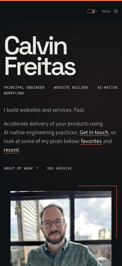
The homepage now starts with a simple introduction followed by recommended reading and recent posts.
A visual system for reading
The new design uses three self-hosted typefaces with different responsibilities:
- Space Grotesk for display type and headings.
- Source Sans 3 for readable body copy.
- IBM Plex Mono for dates, labels, topics, and other publication details.
Orange marks active states, links, rules, and small references.
The site continues to support a dark theme I added earlier this year with the theme toggle included in the site navigation.
More than a résumé on the About page
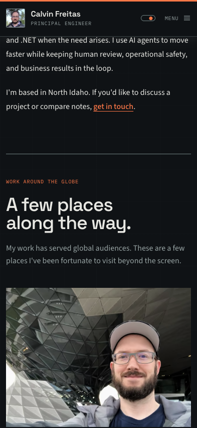
The refreshed About page explains my current work and experience.
The page now includes a few photographs from places I've been fortunate to visit while doing work that serves global audiences.
Wrapped
I'm glad to get the new website look & feel out to anyone who happens upon my site, and I hope it makes it easier to see at a glance what I do.
Take a look around, browse the blog, or get in touch.